For years, food labelling has been confusing, inconsistent and, ultimately, not that helpful.
There have been several different schemes in use, ranging from mind-boggling boxes filled with stats and figures about daily allowance, through to pseudo-colour coding that varied from place to place, sometimes on the front of the pack, sometimes on the back. This all left the consumer with no easy way to compare like with like, which is a sorry state for such an important area of public health.
Consumer groups, governments, producers and retailers have debated this for decades, but with so many different vested interests, agreement has proved unsurprisingly elusive, until now.
Yes, there’s some agreement on a new scheme, and it’s a good one, but the whole exercise has a significant Achilles’ heel …
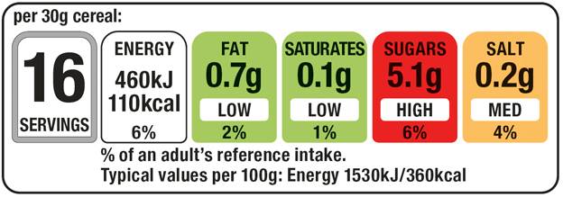
The new food labelling scheme is very simple indeed. It’s based on a traffic light system of colour coding that presents recommended daily allowances – the amount of each component that it’s generally accepted is safe and healthy to eat in a day – with a clear red, amber or green code.
This simplicity is important … purchasing decisions happen in seconds, and nobody – nobody – has the will to read through and understand an old-style box of dense percentages in the aisles of a supermarket. Colour coding gives a quick indication, and helps make choice more informed. Very simple.
The main advantage of this new scheme, and all it really achieves, is a level of standardisation across some brands. The labels look the same wherever and whatever you buy.
But there’s a catch, and it’s a massive one. A huge, multinational vested interest sat in the corner, refusing to take part.